So, you have just renovated your room and want to paint the whole place. That’s great! But staring at those different color swatches makes you doubt everything. Totally get it. Picking the color scheme for your home can be an amazing experience, but also overwhelming. With so many palette ideas out there, it's hard to know where to begin
But hey, it’s your home! So, you just need to find those room color palettes that are total “you”. Don't worry if the inspiration hasn't struck yet – we've got you covered.
In this article, we'll help you pick colors that resonate with your style. We’ll gather some interior color palette ideas here that will transform your space just the way you like
Whether you're on the hunt for the perfect paint colors or working around that amazing accent couch you found, these tips and tricks will get you started.
Color Scheme 101: Understanding Color Theory

The initial step is often the most challenging when it comes to selecting the perfect color scheme for your home. Good thing, we can use the color theory to make the process a lot easier.
Color theory can be used to have a solid foundation of color schemes and combinations. While the term 'theory' might sound daunting, our aim is to explain it as simply as possible. Let's break it down step by step."
First, imagine a giant color wheel. All the colors you see are on this wheel. These are called hues. We can group them into three main categories:
- Primary colors: These are the main colors of the wheel - red, yellow, and blue.
- Secondary colors: These are made by mixing primary colors - green, orange, and purple.
- Tertiary colors: These are made by mixing a primary and secondary color - like red-orange or yellow-green.
Now, let's play with these colors! We can change their look by adding white, gray, or black:
- Tints: Add white to a hue to make it lighter and brighter. Think pastel colors!
- Tones: Add gray to a hue to mute it down a bit. Think of dusty colors.
- Shades: Add black to a hue to make it darker and richer. Imagine deep, dramatic colors.
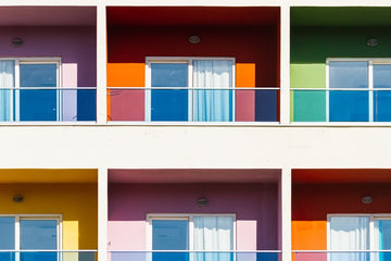
4 Main Types of Color Schemes

Now, how do we put these colors together? That's where color schemes come in! Here are a few popular choices:
1. Analogous
Pick three colors that sit next to each other on the color wheel, like a yellow-orange-orange combo.
2. Complementary
Pick two colors opposite each other on the wheel, like green and red. Use one as the main color and the other sparingly for contrast.
3. Monochromatic
Use different shades, tones, and tints of one single color. This can be simple but might need textures and patterns to add interest.
4. Triadic
Pick three colors evenly spaced around the wheel. This is a bold choice, less common for interiors.
5 Tips in Finding The Ideal Color Scheme for Your Home
The discussion of color theory may have already narrowed down your choices for your space color space. But do you know that following the color wheel isn’t the only way to find a successful palette combination for your home?
Here are a few tips to create a perfect interior color scheme that will fill your home.
1. Define the Right Mood in the Room

Did you know colors can seriously affect your mood? They can make you feel calm, energized, or even a little wild! Thinking about how you'll use each room can help you pick the perfect color scheme.
For example, bedrooms are for winding down, so you might want calming colors. Neutral tones like beige, brown, gray, and white are great choices. Blue is another popular pick because it creates a peaceful, zen-like feeling.
Surprisingly, according to Capitol Design Build, pink and violet can be a calming color depending on the shade.
In choosing a dominant color, remember to take into consideration how that room is meant to be used.
2. The 60-30-10 Rule

Let's say you have a color scheme on your mind, to think about how you'll use color throughout the space. Many designers use a handy rule called the 60-30-10 rule to create balanced and interesting color palettes.
Here's how the rule works:
- 60% Dominant Color: This is the main color that will cover most of the room. In a bedroom, you might use this percentage for your wall paint or a large piece of furniture like a headboard.
- 30% Secondary Color: This color supports the dominant color and adds depth. It could be used for curtains, throw pillows, or a rug.
- 10% Accent Color: This is your chance to add a pop of surprise! It's a smaller amount used for decorative items like artwork, lamps, or throw blankets. This unexpected element keeps the room from feeling too flat and adds a layer of personality.
The 60-30-10 rule can help you balance your chosen color scheme. By following this simple formula, you can ensure your colors work together beautifully. This design rule proves to be useful in mixing and matching different furniture styles.
3. Consider Lightings
Lighting also plays a big role in how colors actually appear in your space. A room with lots of windows might make color appear bright and airy, while a room with fewer windows could make it feel dark and cave-like.
The position of the window also plays an important role. A room with only northern exposure, for example, receives less warm sunlight. To combat shadows and make the space feel inviting, a warm color palette would be ideal.
You can also consider your artificial lighting. Incandescent lamps give off a warm, redder light, while fluorescents tend to be cooler and bluer.
The bottom line? Before you settle on a color scheme, take a good look at your lighting situation. This will help you avoid any surprises once the paint is on the wall.
4. Color Scheme for Windows and their Treatment

Speaking of light sources, never forget to design your windows.
In an article from Forbes, Interior design expert Kelly Simpson offered a clever strategy for using windows to your advantage.
According to Simpson, choosing window treatments that contrast with your walls can highlight the view from your window. This creates a frame that draws the eye to the window.
On the other hand, if your view outside isn’t that spectacular, Simpson suggests choosing window treatments in a color or pattern that blends in with your wall color. This creates a cohesive look and keeps the focus within the room.
5. Consider the Color of Fixed Fixture

At this point, you probably have a color scheme in mind. Great! But before you grab the paintbrush, consider how it will play with your home's existing features.
We’re talking about those fixed fixtures such as wood floors, tile, countertops, and major furniture pieces. Their colors will definitely influence your palette.
If this is your case, our suggestion is to consider the undertones of these finishes. You can use this as a base or the dominant color. From here, you can choose a type of color scheme (Analogous, Complementary, Monochromatic, or Triadic) around them.
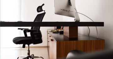
Quality Pieces that Will Perfect Your Color Scheme
Hey, your paint color isn't the only thing that matters for your color scheme! Furniture and equipment also play a big role.
If you're looking for quality pieces for your home, visit our official store on Lazada and Shopee. Qoncept Living offers stylish, functional items that will not only perfect your scheme but also improve your lifestyle.